


TECHNICAL SUPPORT


Published 2026-01-19
Have you ever encountered this situation? Before I finish my morning coffee, alert emails come in like snowflakes. Service A hung up again because the delay of service B it called was too high, and service B was waiting for the response from database C... The guys in the team pointed to each other's code and said it was not their own problem. The whole system is like a tangled mess of headphone cables that can't be untangled and become messy.
It feels like conducting an orchestra without a score. Each musician (that is, each microservice) is working hard, but together they are noise. Why? Because no one knows how to perform the entire piece, who should enter when. At this time, what you need may be surprisingly simple: an architecture diagram. It’s not a esoteric book full of symbols you can’t understand, but a clear “microservice map” that belongs to you.
We like to call it a "living map." It shouldn’t be something that is nailed to the wall and collects dust after painting. Think about it, when a new member joins, how do you make him understand what these hundreds of services are doing in the shortest possible time? Throw him a bunch of document links, or drag him into ten meetings? A constantly updated architecture diagram allows him to quickly find starting points and transfer points just like looking at a subway line map.
When something goes wrong in the middle of the night, this picture should be the first thing the on-call engineer sees. He can follow the lines and quickly locate which "pipeline" the fault is probably stuck in, instead of looking for a needle in a haystack of logs. This saves not just a few minutes, it may be the system's golden recovery time, or even the user's patience.
What’s more practical is that this picture silently helps you save money. It can intuitively expose those "fat services" - a service that does too many irrelevant things, or those hidden redundant call links that go around half the world. Sort these things out, and the numbers on your cloud bill may surprise you.
It has to be real. We have seen too many "Utopia"-style architectural diagrams, which are exquisite, but they seem to be in a parallel world to the online system. The real value is that it faithfully reflects the status quo, even if it’s a little ugly. It only makes sense based on facts.
It has to be something everyone can participate in. A diagram that is only in the hands of the architect will soon become outdated. A good idea is to treat it as a shared asset of the team. Whenever there is a new service, interface change, or dependency adjustment, updating this diagram should become a natural step in the development process, just like writing commit comments.
It's best if it can "move" on its own. If the elements in the map can be linked to the monitoring data - which service node load becomes red, which call link delay becomes longer, and are displayed on the map in real time, then it will be transformed from a static document into an operation and maintenance dashboard. It's like adding real-time traffic flow to your city map.
Don't think about becoming fat in one bite. The first step is to start with the core business process. For example, the action of "user placing an order" goes from front-end click to order service, inventory service, payment service, and logistics service. First, clarify this main line and use arrows to mark the calling direction and key data.
Then, like a jigsaw puzzle, add peripheral services surrounding this main line piece by piece. Authentication service, message push service, points service... Slowly, a two-dimensional but clearly related panorama will emerge. Remember to give each service box a simple label: what it is responsible for, its technology stack, and its current health status.
Tools don’t matter, a whiteboard, drawing software, or even a piece of paper will do to get you started. What matters is the consensus to begin "drawing" the action, and the team's willingness to maintain it. It’s okay to be rough at first, it will become more and more valuable with iterations.
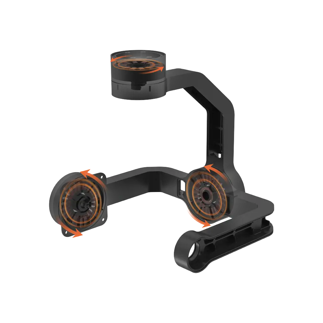
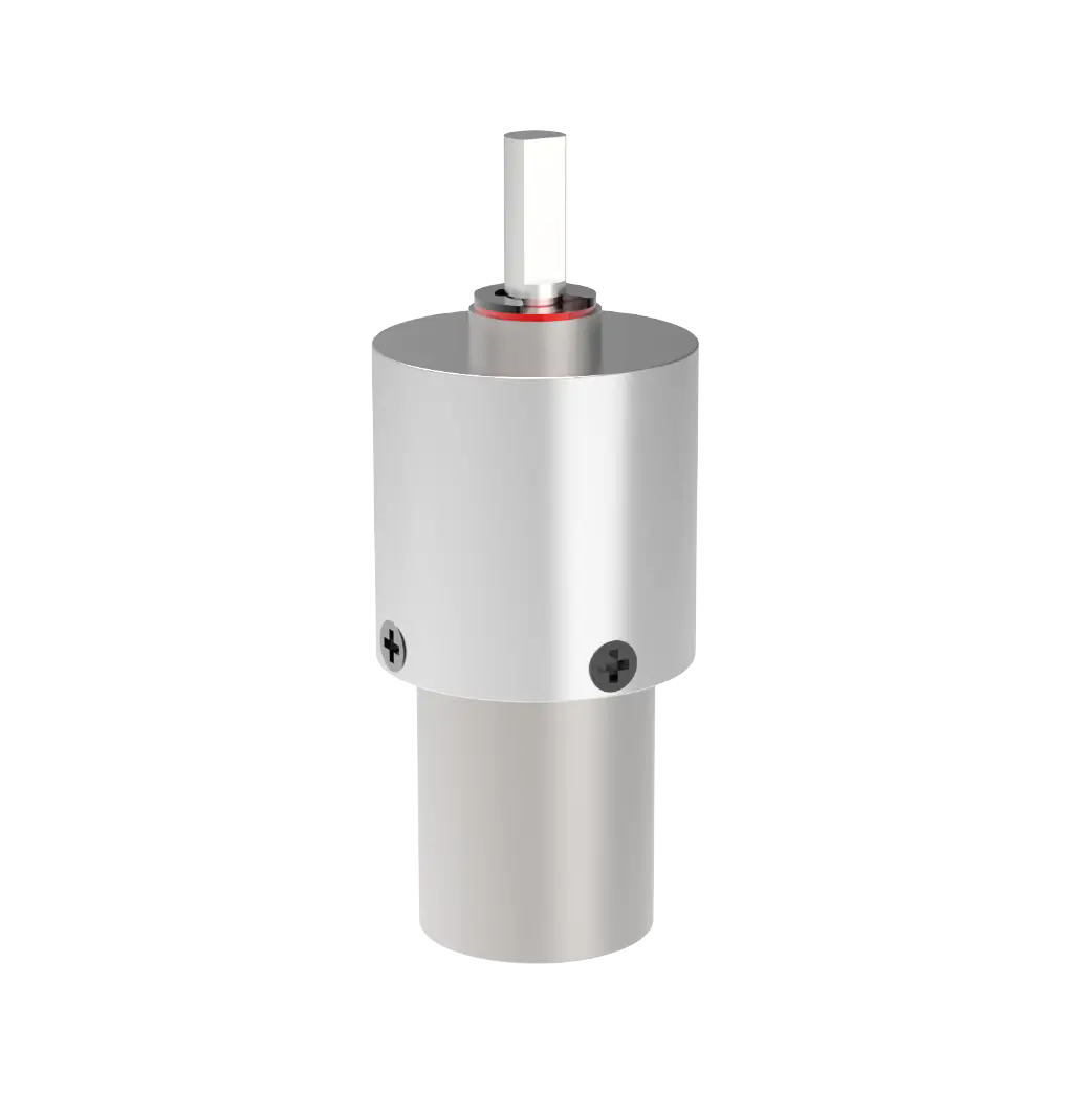
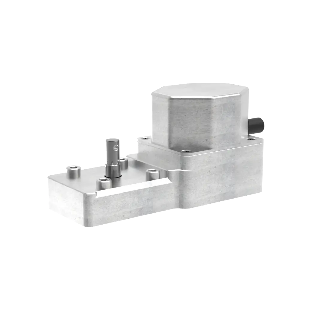
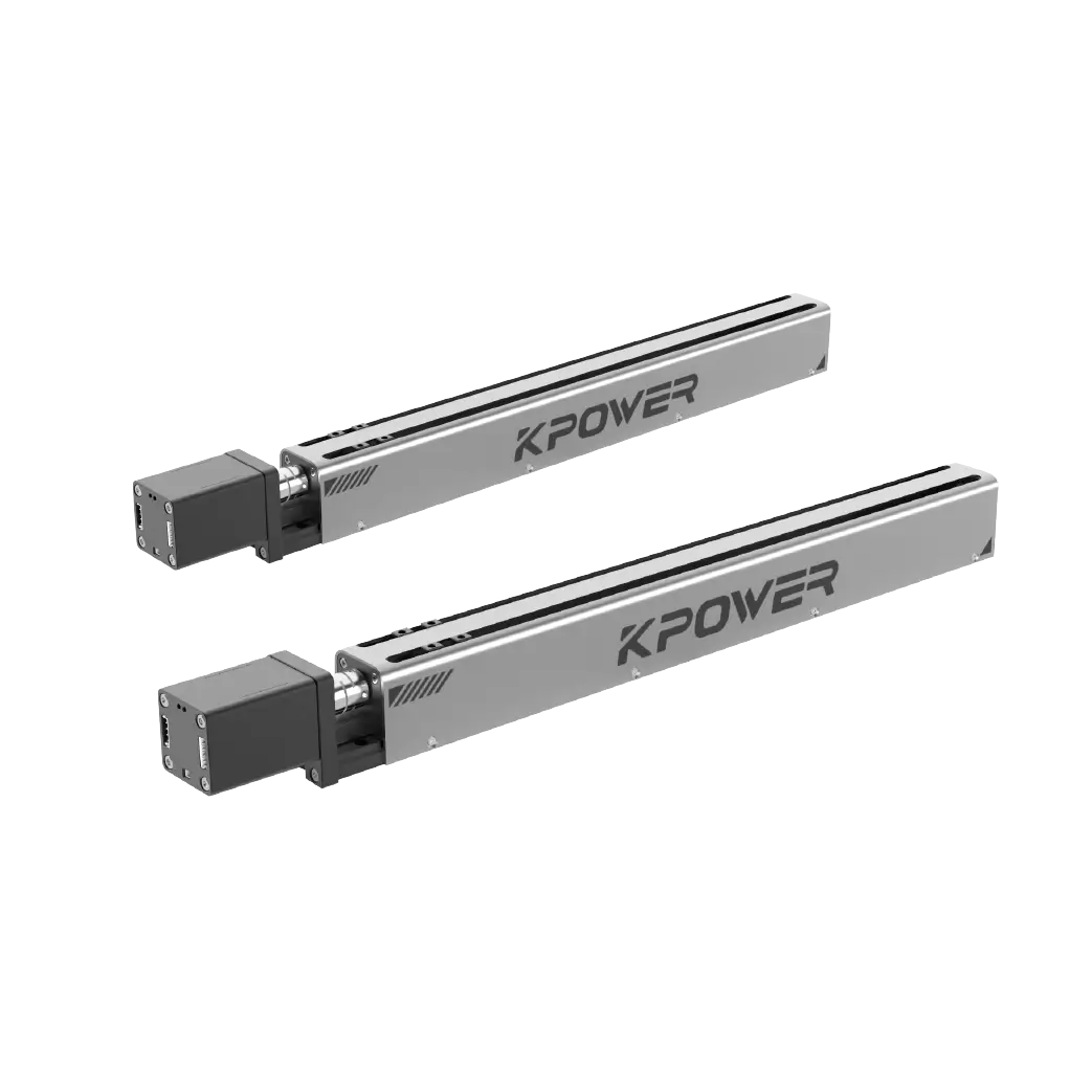
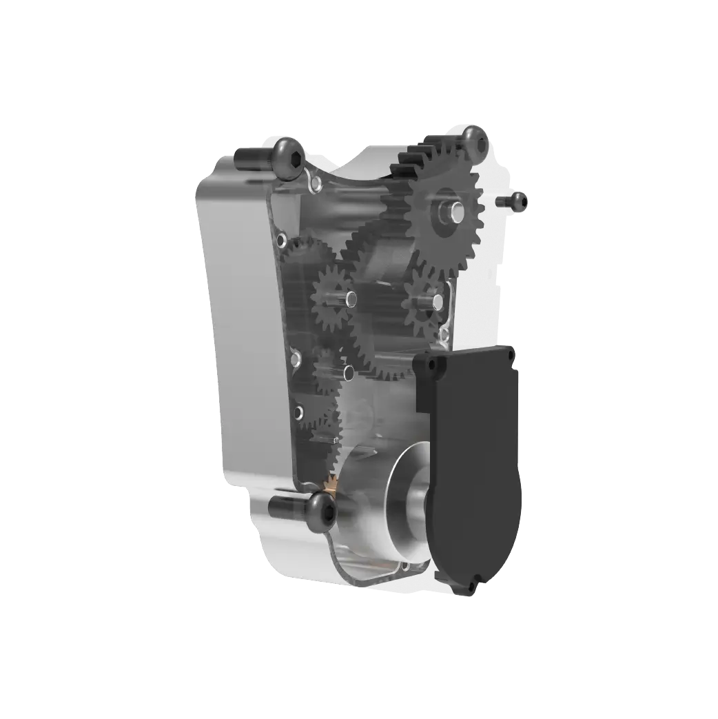
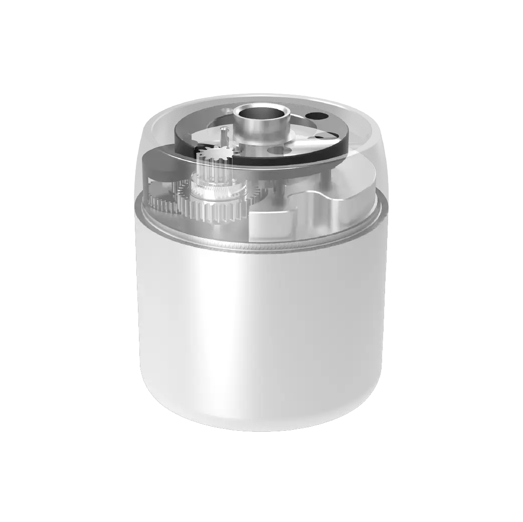
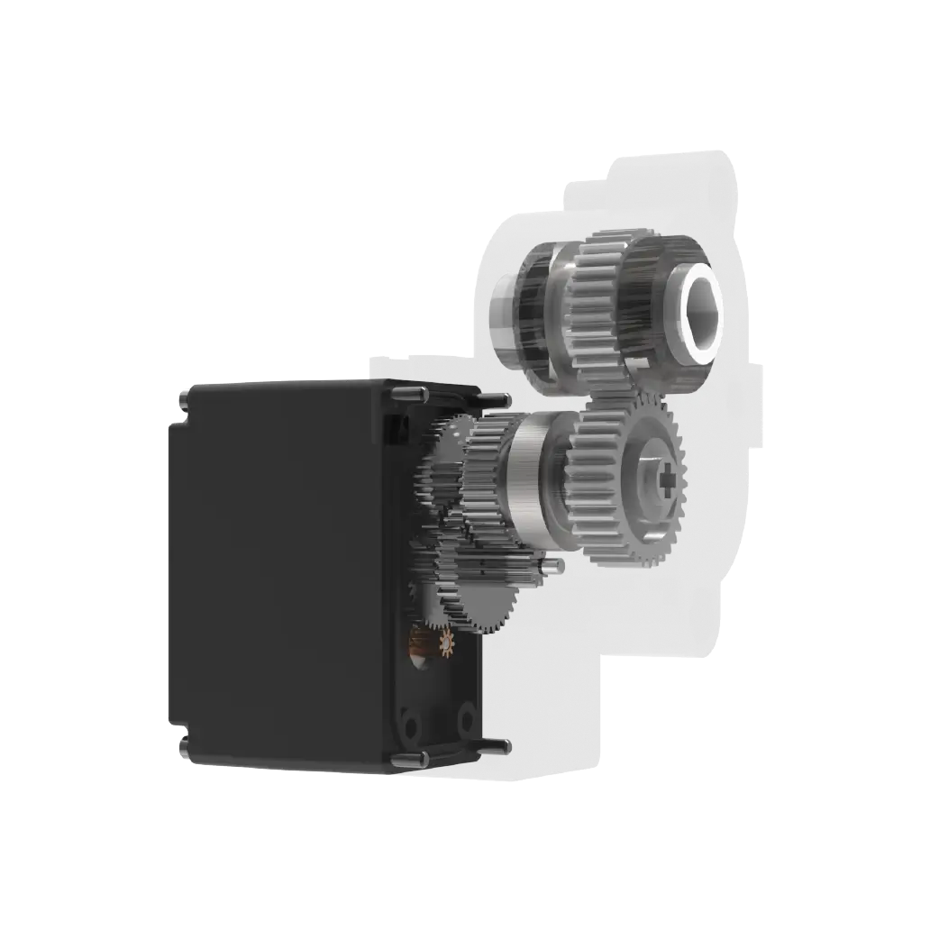
existkpower, we deal with precision servo motors and steering gears all day long, watching how they work together to complete complex mechanical movements under instructions. This gives us a physical level intuition about "synergy" and "system". A microservice architecture is essentially a mechanical system in the digital world. Each service is like a motor, and the architecture diagram is the circuit diagram and sequential logic that controls them.
Without clear drawings, no matter how good the motors are combined, they may interfere with each other, waste energy, and fail to achieve the expected accuracy. We believe that a continuously evolving architecture diagram injects this kind of "order" and "visibility" into your digital system. It won't directly write code for you, but it will ensure that all code is pulling in the same direction.
When each team can find its own position on this map and see its interface with others, the complexity of technology will be tamed and innovation will not be suffocated in chaos. This is not a tedious documentation task, but a core engineering practice worth investing in.
Let’s draw the first stroke. You will find that when the system context is clearly unfolded before your eyes, the sense of control will be addictive.
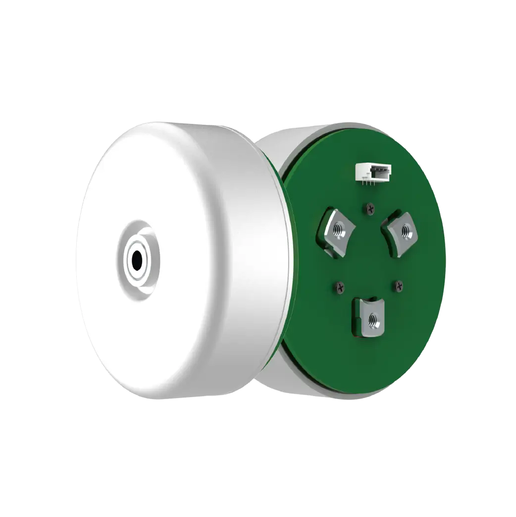
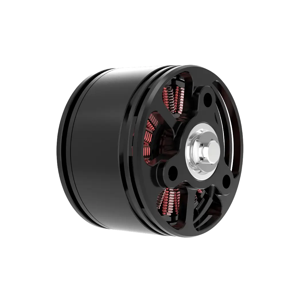
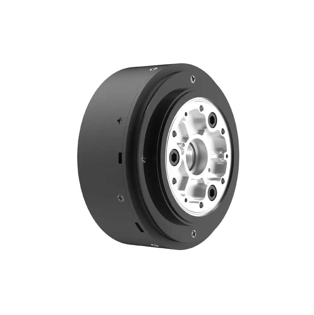
Established in 2005,kpowerhas been dedicated to a professional compact motion unit manufacturer, headquartered in Dongguan, Guangdong Province, China. Leveraging innovations in modular drive technology, Kpower integrates high-performance motors, precision reducers, and multi-protocol control systems to provide efficient and customized smart drive system solutions. Kpower has delivered professional drive system solutions to over 500 enterprise clients globally with products covering various fields such as Smart Home Systems, Automatic Electronics, Robotics, Precision Agriculture, Drones, and Industrial Automation.
Update Time:2026-01-19
Contact Kpower's product specialist to recommend suitable motor or gearbox for your product.