


TECHNICAL SUPPORT


Published 2026-01-19
Imagine: you have a very complex project at hand, microservice architecture, sounds very high-end, right? Each service is quite capable, but together? Communication is like an international conference without an interpreter. Service B could not understand the data generated by service A; service C sent a command, but service D did not respond for a long time. As time goes by, you will find that you may spend more time debugging and making these services "understand each other" than developing the functionality itself.

This question is quite common, right? We often focus on making each service perfect, but forget to design a clear set of "social rules" for them. The result is internal confusion, inefficiency, and even holding each other back.
Is there a "map" that can clearly draw out from the beginning how these services interact and who they serve? Make it not only a technical diagram for developers, but also a "storyboard" that the entire team—even friends who are not so technical-savvy—can understand?
This is where Use Case Diagram for Microservices comes into play. It doesn't care about what is used in your code, it cares about "who" (user or external system) wants to "do" (goal) and "how" your microservice responds to those things.
For example, a simple e-commerce scenario. The user wants to complete the payment. This picture will clearly show that the role of "user" triggers the use case of "payment". This use case may be related to the collaboration between "order service", "payment service" and "inventory service". At a glance, you know which services should be involved and where their boundaries are, instead of waiting until something goes wrong to figure out whose responsibility it is.
Someone may ask: "What is the difference between this and the system architecture diagram we drew before?" Well, let's use an analogy. The architectural drawing is more like the construction drawing of the water and electricity pipelines of the house. It is very technical and tells the engineer how to route the pipelines. The Use Case Diagram is more like a "life line diagram" for the homeowner: cooking here, resting there, and the living room is used to receive guests. It describes the value that the system should provide from the perspective of business and users. If you first clarify "what kind of life you want to live" and then design "how to lay the pipes", it is often less likely to make mistakes.
The idea is good, but when it comes to implementation, the choice of tools often becomes the first hurdle. What you need is something that allows you to focus on the "expression" itself, rather than fighting with cumbersome operations.
It should be intuitive enough. You can drag and drop to connect roles, use cases and relationships, as naturally as building blocks. It also requires a little seriousness and the ability to follow some basic specifications of UML to ensure that what is drawn can be recognized and understood by everyone, rather than just random graffiti. Flexibility is also key - the relationship between microservices is sometimes quite complex. One use case may involve multiple services, and one service may support multiple use cases. The tool must be able to express this many-to-many relationship comfortably, rather than forcing you to reduce it to a simple one-to-one relationship.
More importantly, the charts it generates must be "live". As your microservices iterate and new features are added, this diagram should be easily updated and remain clear and readable. It should be a living document of the project, not a souvenir that is locked away in a drawer after painting.
When we actually start using this diagram to sort out the project, some interesting changes will happen.
Communication costs have dropped visibly. Processes that used to require long meetings and lengthy documents to explain can now be explained with a single picture as the starting point for discussion. "Look, the customer registration process involves these three services, and their interaction point is here." Everyone's eyes have a common focus.
The boundaries of service responsibilities were forced to become clear. In the process of drawing, you will constantly ask yourself: "Which service does this function belong to?" This can effectively prevent the "gray area" of overlapping or missing functions between services. Just like dividing a room into functional areas, there won't be a washing machine in the living room, and there won't be a bed in the kitchen.
Furthermore, it helps you identify dependencies and technical risks in advance. If the diagram shows that a critical use case relies heavily on a service that is not yet stable, the risk light will go off early. You can consider fault tolerance and downgrade plans in advance instead of waiting until something goes wrong after going online.
Of course, drawing is not a one-and-done magic trick. It requires you to paint with a true understanding of the business. The initial diagram you draw may be rough, but as the development progresses, you will continue to go back and correct it, making it more and more refined and closer to the true appearance of the system. The process itself is a very good design polishing.
Maybe you could try reviewing a project you’re currently working on or about to start. If nothing else, just take a blank piece of paper (or a tool you are comfortable with), start with the two or three core business goals, and ask yourself: "Who wants this? What services do we have to meet it? How do they fit together?"
It may be a little unfamiliar at first, like drawing a map for the first time. But as you draw, you may discover some service coupling points that you didn't notice before, or find that a certain service takes on too many responsibilities that should be dispersed. This diagram will eventually become a common language for the team, allowing discussions about system behavior to take place on a clear channel from the beginning.
Good design tools are like giving your thoughts a clear canvas. It does not think for you, but it makes the results of thinking visible, discussable, and iterable. In a world full of dynamic interactions like microservices, such a "social map" may be the key step to get everything started in an orderly manner.
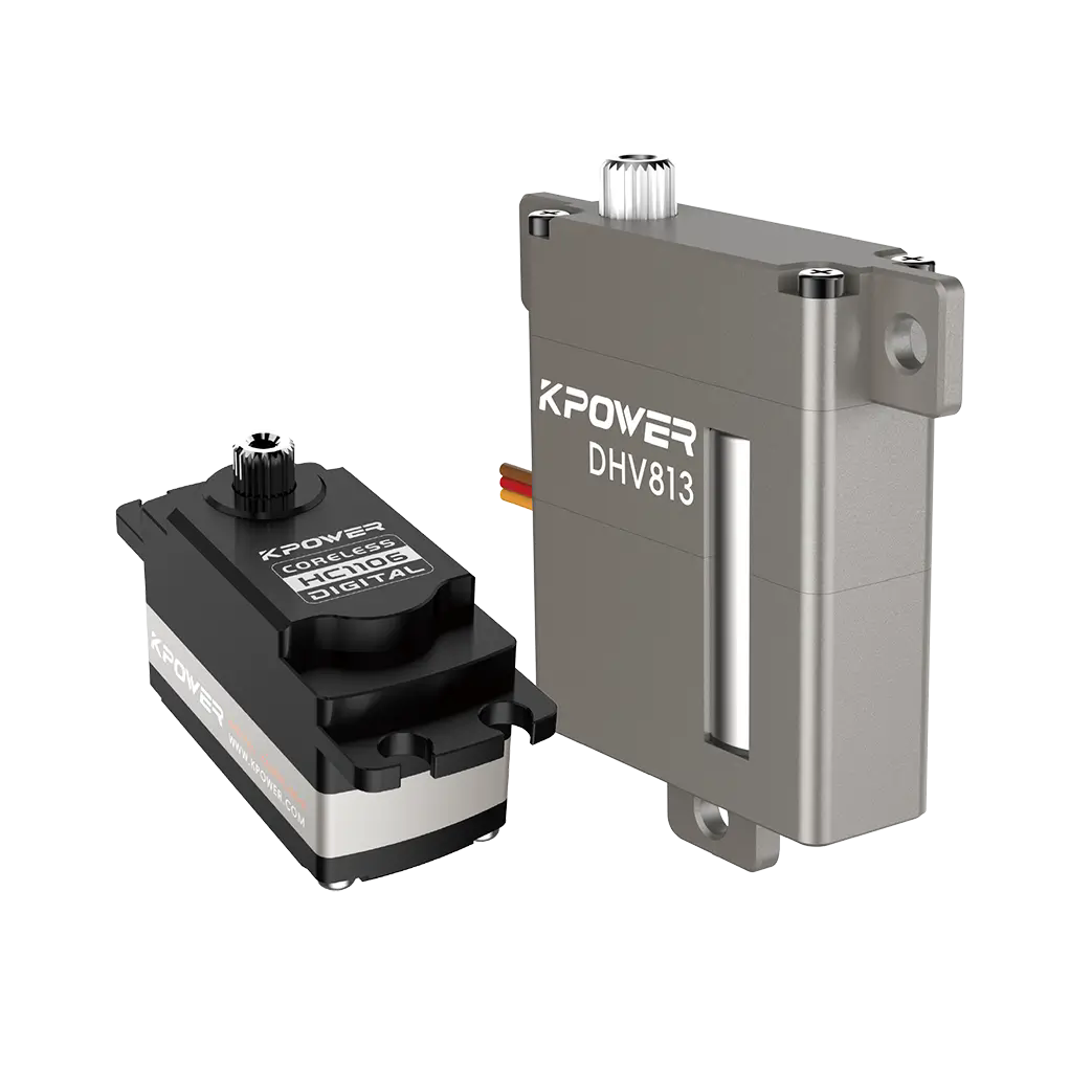
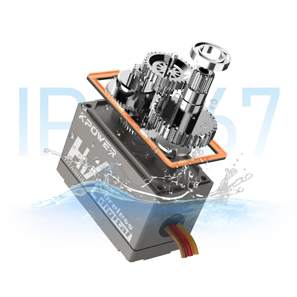
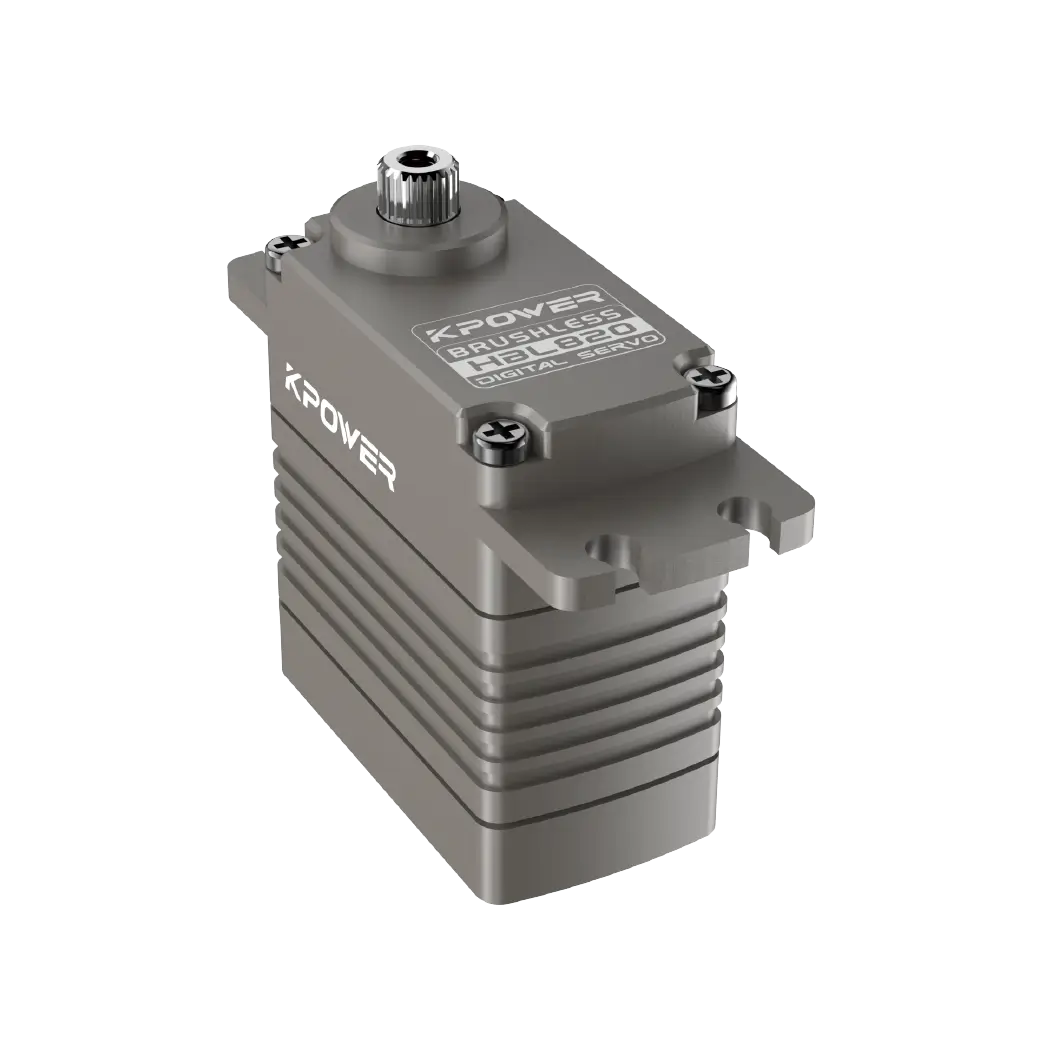
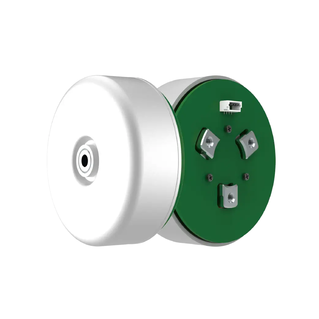
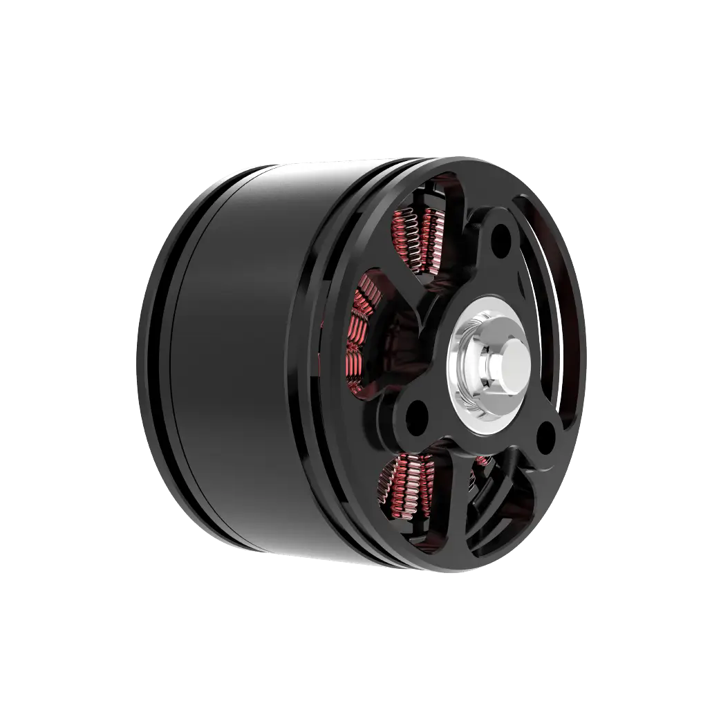
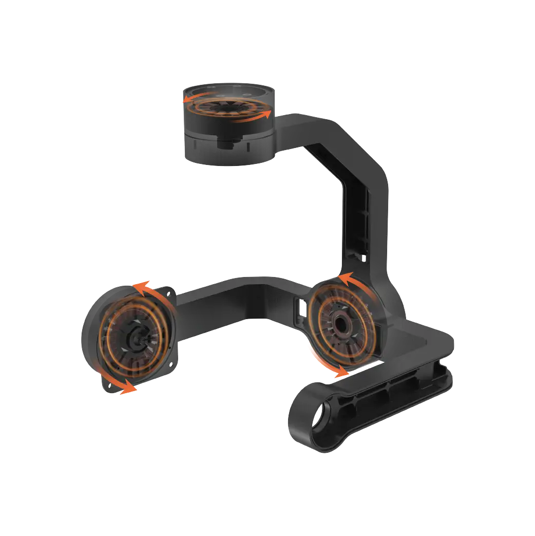
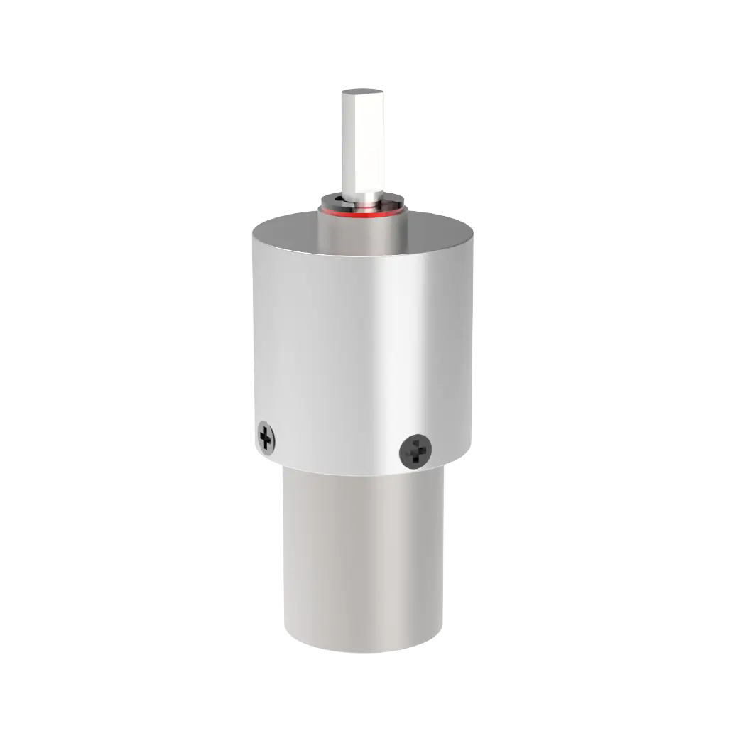
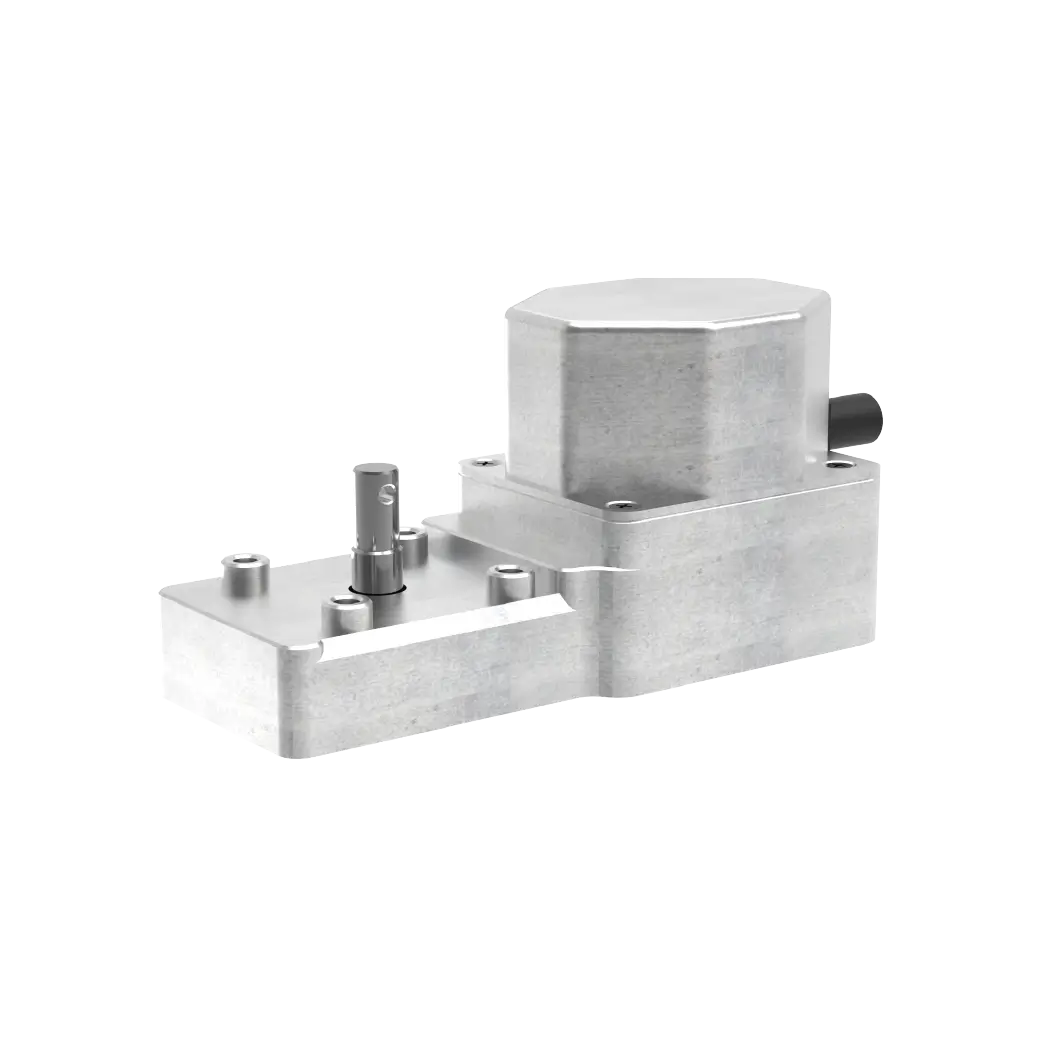
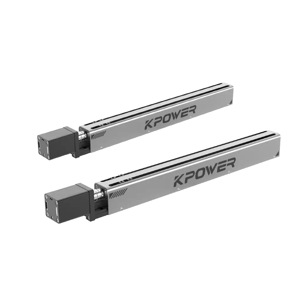
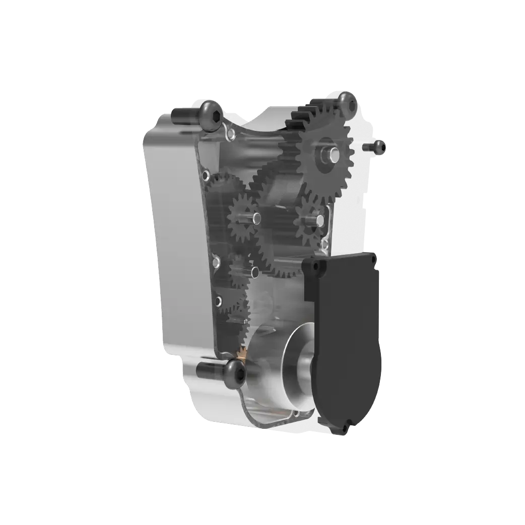
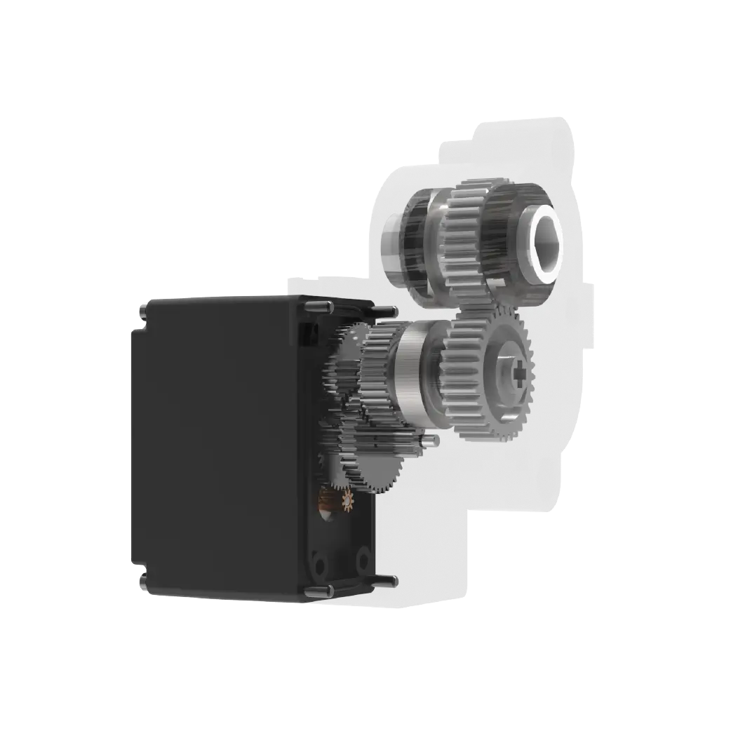
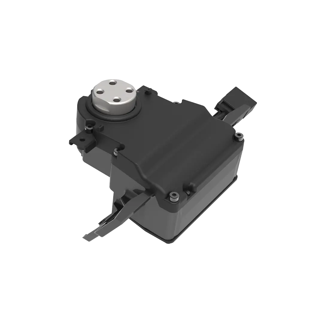
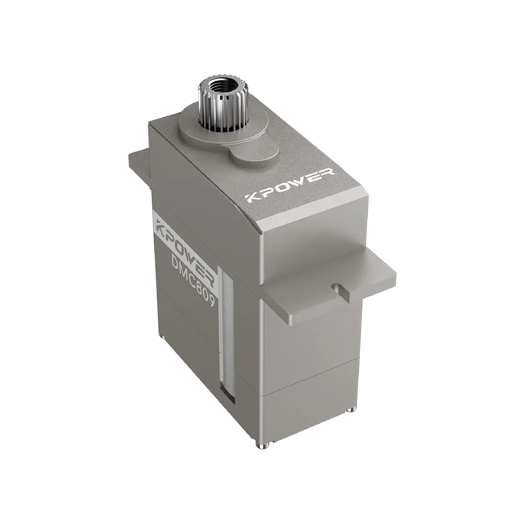
Established in 2005,kpowerhas been dedicated to a professional compact motion unit manufacturer, headquartered in Dongguan, Guangdong Province, China. Leveraging innovations in modular drive technology,kpowerintegrates high-performance motors, precision reducers, and multi-protocol control systems to provide efficient and customized smart drive system solutions.kpowerhas delivered professional drive system solutions to over 500 enterprise clients globally with products covering various fields such as Smart Home Systems, Automatic Electronics, Robotics, Precision Agriculture, Drones, and Industrial Automation.
Update Time:2026-01-19
Contact Kpower's product specialist to recommend suitable motor or gearbox for your product.